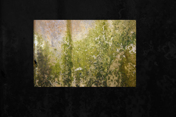
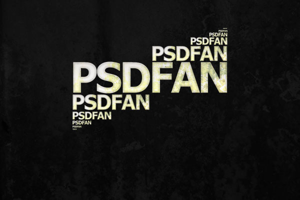
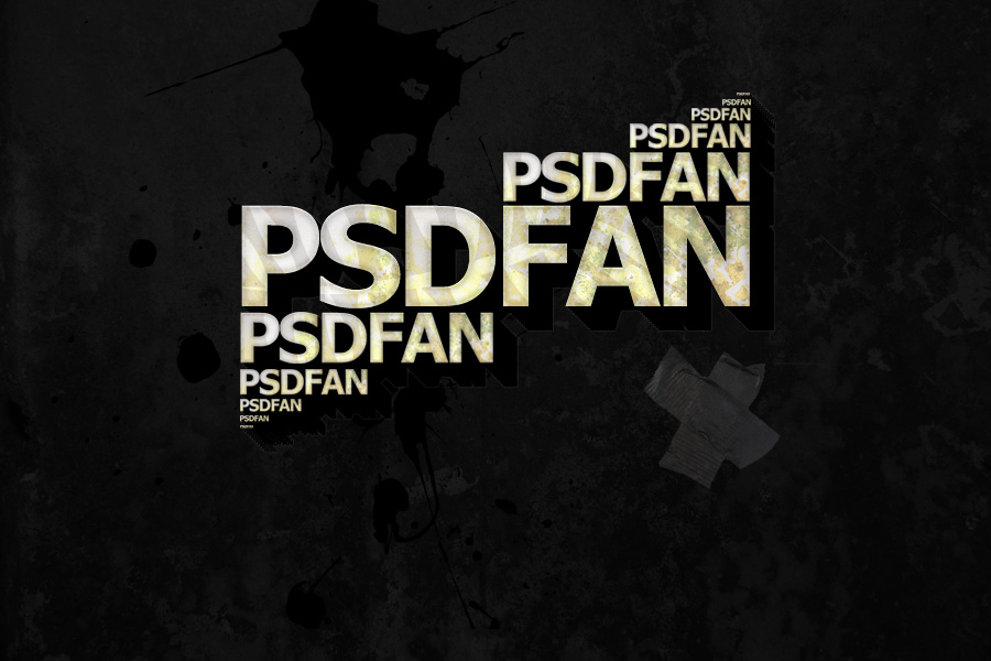
Final Image:
Here is the final image that we’ll be creating:

Step 1:
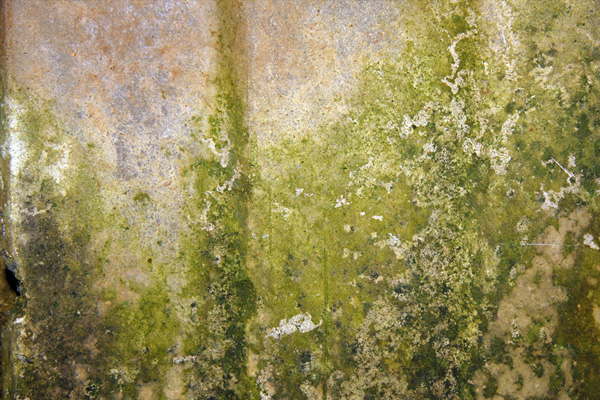
Open up your background image. For this particular example I’ve chosen this lovely example of a mouldy wall.
Step 2:
Go to image > adjustments > desaturate to grayscale your image. Then go to adjustments > brightness/contrast and reduce the brightness to -100, and contrast to -90.

Step 3:
Now I want to add some text to the center of my document. An easy way to do this is to drag from one edge of your document to the other using the horizontal type tool. Then simple align any text that you’re going to type to center. I’ve chosen a nice larger, bold Tahoma font, mostly because it matches my logo.

Step 4:
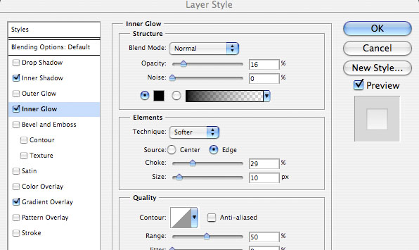
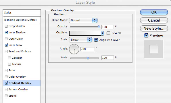
Next go to layer blending modes, and select an inner shadow, inner glow, and gradient overlay with the settings shown below. The outcome will look something like this:


Step 5:
Open up your original mould image again and paste it onto a new layer above your text layer. Make sure that you resize it to be roughly the same width as your text.
Step 6:
Now hide this new mould image layer to reveal the text underneath. Select your text layer. Use the magic wand selection tool to select around the text, and also the areas within the text (the gaps within the P, D and A). With your selection in place go back to your new mould image layer. Go to layer > add layer mask > hide selection. This will hide the area around your text, meaning that your mould image now is in the shape of your text.


Step 7:
Change your mould imagery layer blending mode to ‘hard light’ and reduce it’s opacity to 50%.

Step 8:
I now want my finished text complete with effects/textures to be on one easy to edit layer. I can’t merge layers down to achieve this as it will mess up some of my layer styles. Instead I simply hide my background layer and go to layer > merge visible.

Step 9:
Now duplicate your merged text layer. Move your duplicate layer beneath the original and use edit > transform resize to resize your duplicated text layer to about half the size of the original. Position this below the ‘PSD’ part of your original larger text. Duplicate the smaller text layer and position this about the ‘FAN’ part of the larger original. Resize a tiny bit where necessary to get it to fit nicely above the letters.

Step 10:
Repeat this resizing technique, positioning the smaller text below the PSD of the bottom text, and above the FAN of the top text.

Step 11:
Keep repeating this until you can’t go any smaller. You will need to magnify in to work with the ultra small text after repeating this a few times. Finally go to layer > merge down and merge all of these text layers into one single layer.
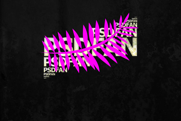
Step 12:
Now create a new layer above your text layer and make a large custom shape that covers most of your text. It’s important that the custom shape allows much of the text through, despite almost being the same size. I’ve made the shape pink in the example below just so that you can see it more clearly.
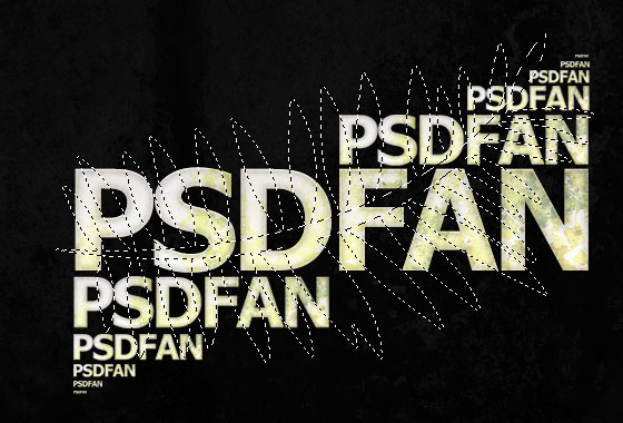
Step 13:
Rasterize your custom shape layer and select around the shape using the magic wand tool. Then hide the custom shape layer and go back to your merged text layer, selection still in place.
Step 14:
Then go to image > adjustments > hue/saturation. Make the hue -10, saturation +20 and lightness -10. The outcome should look like the example below:


Step 15:
Duplicate your text layer. Go back to the original layer underneath the duplicate and go to image > adjustments > brightness/contrast. Reduce brightness to -100 and up the contrast to +100. This will make the text completely black. Then using the arrow keys on your keyboard to move the layer down 2px and right 2px. Duplicate this layer and do the same. Keep repeating this until you have a kind of 3d shadow effect coming from the top text layer, which is still in tact. Finally merge all of these black text layers into one.

Step 16:
Now go to the layer blending options for this ‘black text’ layer and apply a white stroke, size=1, opacity=6%. You should get something like the outcome below:


Step 17:
Now paste onto a new layer an image of some sticky tape. Select the white background using the magic wand tool and delete it. Resize and move the tape to an appropriate place and reduce the layer’s opacity to 25%.


Step 18:
I wanted to add a little something to the background of my image, so I grabbed an awesome image of a paint splatter. Credit goes to Didi90, and the original image can be found here: http://www.sxc.hu/photo/906249. I pasted this paint splatter onto a new layer below my text layers, but above my original mould background.

And we’re done!
To blend the splatter image nicely I simply set the layer’s blending mode to ‘multiply’. I hope that you found this tutorial useful, and as always would love to see people recreate my work! Please click the image below if you would like to download the full sized version free!
Comentarios