STEP 1 |
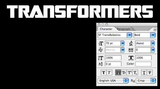
Because this is a text effect will attempt to replicate the original Transformers text, it’s important to have the right font. I did a little looking and found a font called SF Transbotics at dafont.com (*note: I’ve included the font files in the exercise download at the bottom of the lesson). Go download and install the font before you proceed.. unless of course you’d prefer to use a less cool font.. and in that case, lets get started. (*note: You may need to restart Photoshop once you’ve installed the font on your system to get it to appear in the Photoshop fonts list.) Open a new document (mine is 540×300 at 72ppi). Press the D key to reset the foreground and background colors to black and white respectively then press Option-Delete (PC: Alt-Backspace) to fill the background layer with black. Change the foreground to white by pressing X to switch the foreground and background colors, then select the Text tool from the Tools bar by pressing the T key and type out your text in a nice large size. (*note: Center your text side to side and top to bottom.. I’ve only shifted my text in the example to show the Character palette settings I used. |
 |
STEP 2 |
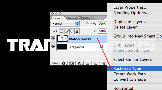
In the original Transformers logo the letters T and F extend below the rest of the word type. In order to do this we need to rasterize the test by right-clicking (Mac: Conrol-Click) on the text layer in our layers palette and choosing Rasterize Type from the menu. This turns our layer from editable type into a standard graphic. |
 |
STEP 3 |
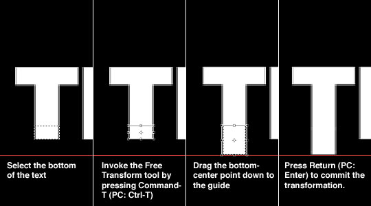
With the text rendered as a graphic we can use the Rectangular Marquee tool (activated by pressing the M tool) to select the bottom of the T and F letters and by using the Free Transform tool to lengthen the bottom of the letters. (*note: to get both letters exactly the same I placed a guide below the text.) |
 |
STEP 4 |
With the letters extended you can clear your guide by selecting View>Clear Guides from the main menu. |
 |
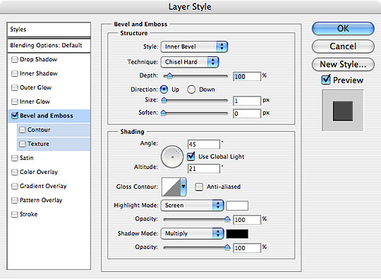
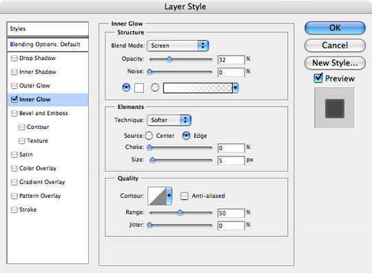
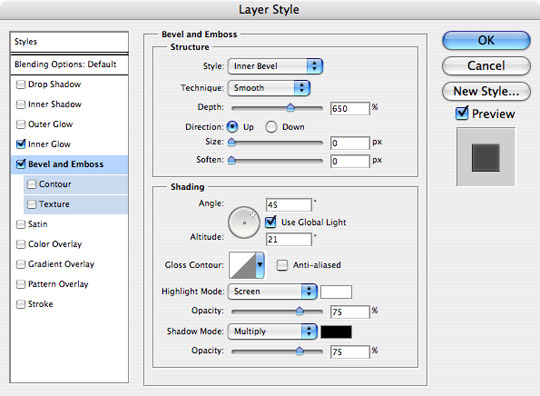
STEP 5 |
Next we are going to create a 3D effect by adding a bevel and emboss to our text layer and then duplicating and nudging that layer repeatedly. First, lets add a layer style. Double click to the right of the layer name in the layers palette to bring up the Layer Style dialog (*note: you can also right click (Mac: Control-Click) on the layer and choose Blending Options to bring up the Layer Style dialog.) In the column at the left of the Layer Styles dialog click Bevel and Emboss and apply the following settings then click OK to apply the layer style. |
 |
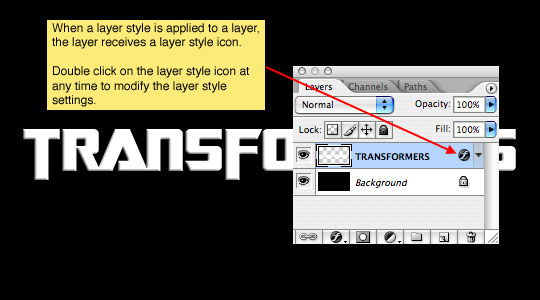
STEP 6 |
By adding the Bevel and Emboss layer style we have created the edge shading that will be visible in our next step. |
 |
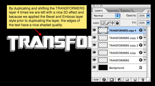
STEP 7 |
To create the illusion of 3D text we will now duplicate our text layer multiple times, each time shifting the text up and right. To duplicate the selected layer simply press Command-J (PC: Ctrl-J) or select Layer>Duplicate Layer from the main menu. This will create a new layer above the selected layer. To shift the text, make sure you have the move tool selected by pressing the V key, then using the arrows on your keyboard press the up key and then the right key each one time. Repeat the duplicate and move process 3 more times until you have a total of 5 layer copies. |
 |
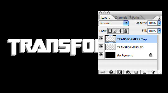
STEP 8 |
At this point I’d recommend merging the bottom 4 layers of our 5 layer 3D set by clicking on the second layer from the top, holding down the Shift key and then selecting the bottom layer in the set, effectively selecting all 4 layers that comprise the 3D edge. Press Command-E (PC: Ctrl-E) to merge the selected layers. We don’t actually want Bevel and Emboss layer style on the top layer, so right click (Mac: Control-Click) on the layer style icon of the top layer and choose Clear Layer Style. I also double-clicked on the layer names and changed the names to "TRANSFORMERS Top" and "TRANSFORMERS 3D". |
 |
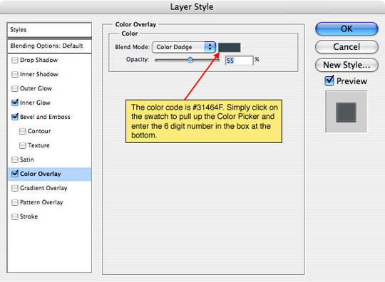
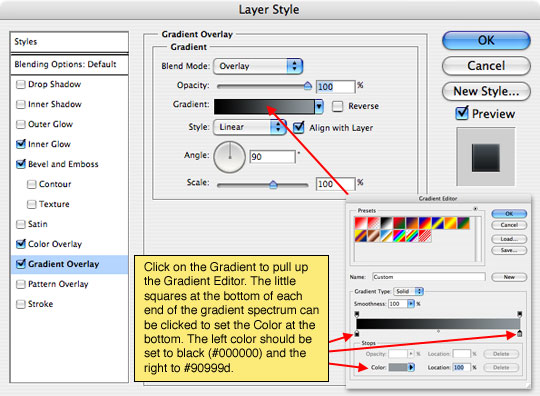
STEP 9 |
With the "TRANSFORMERS Top" layer selected we are going to add a series of 5 layer styles that will give the layer it’s aged stone look. I am going to place each of the layer styles in series here so all you need to do is go down the list and apply them. Anything out of the ordinary will be pointed out in the yellow boxes. Right click to the right of the layer name and apply the following 5 styles. Click OK when all the styles have been added. |
     |
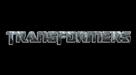
STEP 10 |
The document should how look like the one below. |
 |
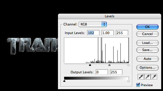
STEP 11 |
Looking at the effect so far it becomes obvious that the 3D edges are too light. To solve this problem, click on the "TRANSFORMERS 3D" layer to select it, then bring up the Levels dialog by pressing Control-L (PC: Ctrl-L). Drag the left hand slider in towards the middle until the 3D edges look right. |
 |
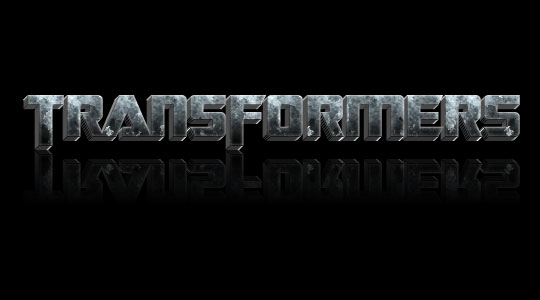
STEP 12 |
For the final image I just added a reflection by duplicating the text and 3d layers, merging them, flipping them vertically, dropping the opacity to 30% and then adding a gradient layer mask. |
 |
Archivo 95 mb aprox idioma español Requisitos WinXP El sistema Audaces Vestuario es la solución para la industria de la confección, desarrollado especialmente para agilizar los procesos de Diseño, Escalado, Trazo y Corte. Se compone de dos módulos, uno de Patrones y uno de Trazo. Patrones Audaces Patrones es un modulo realmente fácil de utilizar. El diseñador crea los moldes directamente en la pantalla del computador,sin uso de la mesa digitalizadora, de una forma rapida y eficiente,usando las innumerables herramientas de diseño disponibles.Adicionalmente, proporcionara la creación de moldes base dentro de los estándares técnicos de la industria, o sea con tablas de medidas,áreas de costura acondicionadas a los equipos de producción, estudios de encogimientos, etc. Escalado En Audaces Patrones se escalan los moldes con facilidad, precisión rapidez y seguridad. Trazo Audaces Trazo elabora Trazos con excelente aprovechamiento en pocos minutos. A través del Trazo automático, y pe...
Comentarios